In the world of packaging design, typography is more than just choosing a font. It’s an art form that can make or break your product’s appeal. Whether you’re designing packaging for a luxury skincare line or everyday snacks, typography plays a pivotal role in creating the right first impression.
So, what are the typography secrets that packaging experts know? In this article, we’ll reveal how typography influences consumer perception, boosts brand recognition, and enhances the overall packaging design.
Why Typography Matters in Packaging Design
The importance of typography in packaging cannot be overstated. It’s not just about how a product looks—it’s about how it speaks to the consumer. Effective typography can convey:
- Brand personality: Is your brand playful or sophisticated?
- Legibility: Can the consumer easily read important details?
- Emotional connection: Does your font choice evoke the desired emotion?
The right typography draws attention and guides the consumer’s eye to the key information, all while reinforcing your brand’s identity.
The Role of Typography in Brand Identity
Typography is a powerful tool for brand storytelling. It communicates your brand’s message before the consumer even opens the package. A font can evoke feelings of elegance, trustworthiness, or playfulness, depending on the context.
Choosing Fonts That Reflect Your Brand
When designing packaging, consider how your font aligns with your brand’s values. For example, a sleek, modern sans-serif font might work well for high-end products, while a fun, handwritten font could be perfect for youthful, casual items.
For instance, if you’re designing a baby food pouch, you might lean toward soft, rounded fonts to evoke warmth and safety. A minimalist sans-serif typeface might be the best option to communicate clean, pure ingredients, emphasizing the product’s natural aspects.
Creating Consistency Across Product Lines
One secret packaging experts know is that typography consistency across different product lines is essential. Using the same typefaces across all your products builds brand cohesion and strengthens brand recall.
This is especially important for products like freeze-dried food pouches, where clarity and legibility are paramount. A consistent typography style ensures that your brand is instantly recognizable on store shelves, even if the consumer is unfamiliar with a specific product.
Balancing Readability and Style
A common mistake is choosing aesthetic appeal over readability. While it’s tempting to go for a fancy, decorative font, legibility should always be your top priority, especially for key information like product names, ingredients, and instructions.
Choosing Fonts That Are Easy to Read
Here are some expert tips for selecting fonts that balance style with readability:
- Limit the number of fonts: Use one or two fonts on your packaging for consistency.
- Font size matters: Make sure essential text (like product names) is large enough to be read at a glance.
- Avoid overly decorative fonts: Fancy fonts may look beautiful, but they can often be hard to read, especially in smaller sizes.
For instance, flexible barrier bags that contain food or nutritional supplements benefit from clean, easy-to-read typography, ensuring consumers can quickly absorb vital product information like serving size or ingredients.
The Hierarchy of Typography
Another key secret is understanding typographic hierarchy. This refers to the use of different font sizes, weights, and styles to create a visual order. The goal is to guide the consumer’s eye to the most important information first and then lead them down the hierarchy.
- Primary text (e.g., product name) should be the largest and most prominent.
- Secondary text (e.g., flavor or size) should be smaller but still clearly visible.
- Tertiary text (e.g., ingredients, nutrition facts) should be readable but less dominant.
By establishing a hierarchy, you help customers process information quickly and easily. This is especially crucial when designing for products that need to be understood instantly, like baby food pouches.
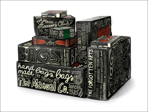
Creating Visual Interest With Typography
Typography isn’t just about legibility—it’s about creating visual interest that stands out. Packaging experts know how to use typographic contrast to grab attention and convey the right message.
Play With Weights and Styles
To create visual contrast, mix different font weights (bold, regular, light) and styles (italic, condensed) to create interest. For example, the product name could be in bold, while secondary details (like flavor or size) can be in regular weight.
Experiment With Letter Spacing and Line Lengths
Don’t forget about letter spacing (tracking) and line lengths. Expert designers use these to create a clean, cohesive look. Proper tracking ensures that the letters don’t crowd each other, making the text easier to read. A balanced line length, with an appropriate amount of white space, can significantly improve the legibility of your packaging.
The Emotional Power of Fonts
Typography is deeply tied to emotion. A particular font can set the tone and mood of a product, influencing how the consumer feels about it.
Fonts That Evoke Trust
For packaging in markets like health supplements, trust is a crucial factor. Fonts with clean lines, like sans-serifs, tend to be associated with modernity and reliability. They help customers feel confident in the product’s quality.
In contrast, serif fonts can communicate tradition and stability. They are often used for products with a long history or for luxury goods. However, balance is key: fonts should still be legible and suited to the product’s positioning.
Fonts That Spark Joy
If you’re selling something more playful or indulgent, like freeze-dried food pouches, fonts with rounded edges or handwritten-style lettering might elicit a sense of fun and creativity. These types of fonts help create an emotional connection with the consumer.
The Future of Typography in Packaging Design
As technology and design trends evolve, so too does the role of typography in packaging. With advances in digital printing and customization, designers have more flexibility to experiment with typography in new ways.
Personalization and Typography
The future of packaging typography will likely involve more personalized designs. Consumers are increasingly looking for packaging that feels tailored to them. Whether through customized text or unique typographic designs that reflect their personal preferences, this trend could revolutionize how typography is used in the industry.
Conclusion
Typography is one of the most powerful tools in a designer’s arsenal. It’s not just about choosing a font; it’s about using typography to enhance brand identity, create emotional connections, and ensure clear communication.
By focusing on legibility, balance, and consistency, you can elevate your packaging design and create a lasting impression.
If you’re looking to create packaging that stands out while still communicating your brand’s values, paying attention to the typography secrets only packaging experts know will give you the edge. Whether you’re designing baby food pouches or freeze-dried food pouches, typography is an integral part of the design process that can make all the difference.